
Here’s an example of a paper map design for a Multiplayer shooter game. Here’s step by step how I went from scratch to top down map.

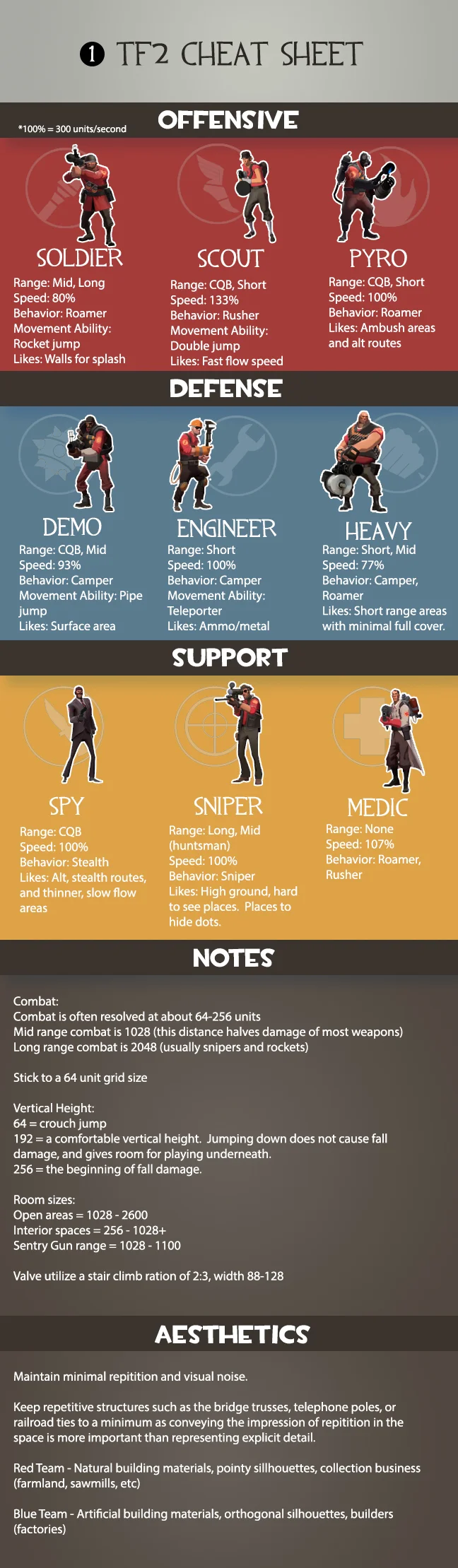
1 - TF2 Cheat Sheet: First I gather information about player combat and movement abilities. The map needs to allow players to use and show off mastery of their abilities. The more your map accommodates this and doesn’t get too off balanced the more successful it will be.
If the game already has a set aesthetic you don’t normally want to deviate from it unless you have to. A lot of the Aesthetics is about informing the player as to the mission objectives and team ownership. Changing up things like shape language and colors that have already been taught to the player could easily lead to confusion.
2 - Strategy: Now that the information is gathered I’ll start on the Flow Map.
To help me find where I should be adding alternate routes I created a pacing graph to help. For this instance, the slower the pacing the less entry ways into the room and if it needs to be faster I add more. I’ll get more in depth into pacing graphs in another post.
For building the Detailed Flow maps I used Google Drawings since it has multiple elevations. With it you can create shapes and connect lines to them that stick to it when you move them around, plus it’s easy to change their color on the fly. For this map I wanted to go with two major routes, so I stuck them close together so the alt routes connecting the two wouldn’t take them out of major combat for long. Originally the ground level route was on the second story but this would keep players using alt routes out of the main flow for longer than I wanted.

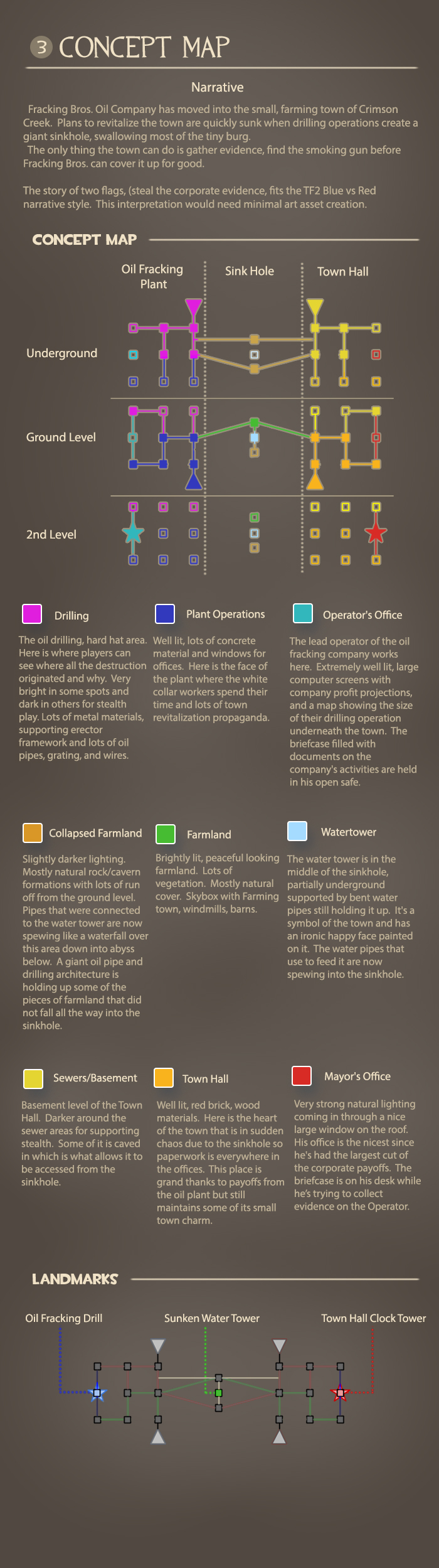
3 - Concept Map: With the basic design done I can get to the visuals. First I create a narrative that will work with the current game. Certain things I kept in mind while doing this. The more the two bases contrast the better for orientation, show confrontation, try to use a story that can be explained with a lot of the current art assets, and use current TF2 Red vs Blue tropes and ideas but with something fresh.
4 - Top Down Map: The amount of detail I put into a top down map changes wildly from project to project. Sometimes I’ll throw the detail map into Photoshop and do a quick paint over. This time around I built it out in Maya since I wanted to use its grid and to help visualize line of sight for important cover objects. I used Maya instead of TF2’s editor, Hammer, because I’m a lot faster with it. In Maya I created a box that was 300 units long so I could place those around to make sure I was sticking to the Scale Map I made earlier. Then I made a Sphere the size of a Sentry Gun’s Aggro radius to help me build areas out for the engineers. This is important since they are a class built to select and invest time into strengthening an area.

5 - Reference Map: For my last step I build a reference map. Usually collect these images from google searches but I also have a library of screenshots from past games I’ve played that becomes helpful. This step is great for being able to present your map to your team so they can help visualize it and especially if you’re working with artists who need to do an art pass on the level.
With the paper design solid I can finally start building it out in game. This may seem like a ton of documentation but it’ll feel like no time at all compared to the amount of time you save. Whenever you have a playtest and something isn't working right you’ll know the source of the issue and how changing it will affect the overall gameplay, scale, pacing, navigation, and flow.